Sunday, April 13, 2014

M.F.B.

Quick little post for the My First Blaster kit by MakeToys. This little kit allows you to make a gun for the character Swerve as seen in recent Transformers comic books.

Can we build it?!
What is the MFB? From the wiki article: "'My First Blaster' is a fun, safe way for Autobots with hands too little for normal guns to rain hot death on any and all potential targets."

Almost done
Such tiny pieces
All done
Overall it's a pretty nice representation of the gun from the comic, especially when paired with the unofficial Swerve figure also made by MakeToys.

From tfwiki.net. Copyright Hasbro
And why does one need a small gun for little hands?

Because accidents happen

Friday, March 7, 2014

Alternators

In the early 00's I really wasn't collecting much in the way of Transformers. I picked up a figure here and there, but overall the toyline didn't really grab me. In the back of the little catalog that came packed with the figures was an advertisement for the Alternators toyline. The focus of these figures were fully licensed 1:24 scale vehicles that were re-imaginings of characters from the original toyline and cartoon.

Smokescreen was the first toy they released. Based on a Subaru Impreza WRC rally car.

I'd love one these in real life
Fancy
Unfortunately the wheel doesn't work
They really went all out trying to make them appear to be models. In fact, I've had friends that thought they were. Of course they wouldn't be as much fun if that were the case.

It almost doesn't look like a folded up robot

An interesting side note on the underside of the car. While the steering will isn't tied to the wheels, the wheels are connected to each other. Each wheel has a magnet in it that ties it to a piece that runs the width of the car.

Classic car robot styling

Overall it's a pretty nice robot mode. Decently kibble free, that is, there's not a lot of car junk hanging off of it. One of my biggest issues with it is the feet. It's not necessarily that they're huge, which they are, it's that they don't provide the most solid base for the figure.

Those are big feet

One of the issues is that he doesn't have any toe swivel or ankle tilt. If you splay his legs, he only stands on the edges of his feet. Another issue is that the heel is a small rotating tab which has to work double duty to provide back support but also to keep the wheels off the ground. Finally, it can be awfully fiddly to get back into car mode. The legs have been bend at a fairly specific angle in order for the rear sections of the car to line up and tab correctly to minimize panel lines and gaps.

Little more car-like from behind

All in all, it was a great way to kick off a new toyline. They would eventually release figures based on the Mazda RX-8, which was an evolution of this basic design and fixed many of it's flaws.

The toyline itself saw the release of twenty-seven figures across thirteen car models. But those are other robots for other posts.


Thursday, February 27, 2014

Birthday Robits!

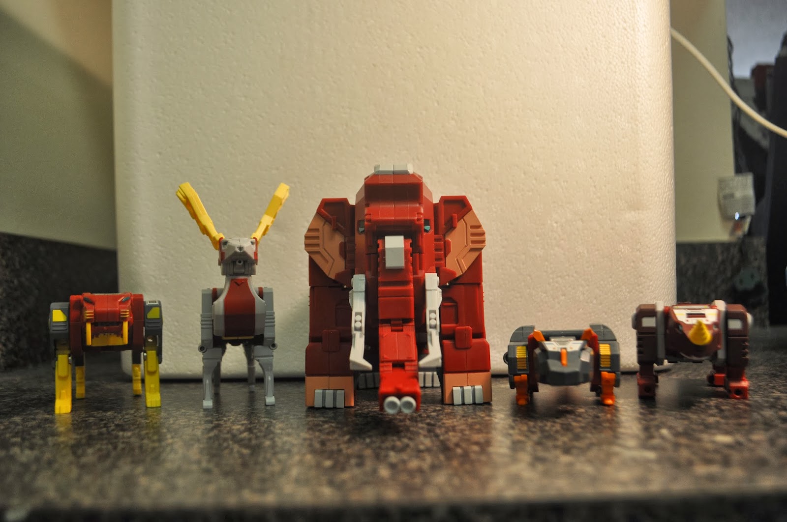
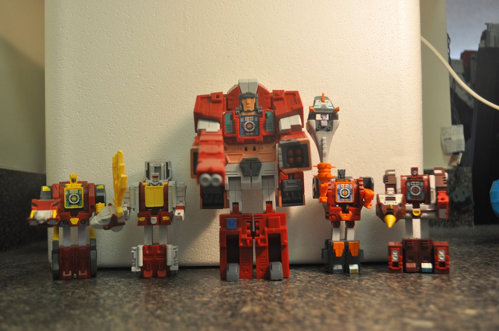
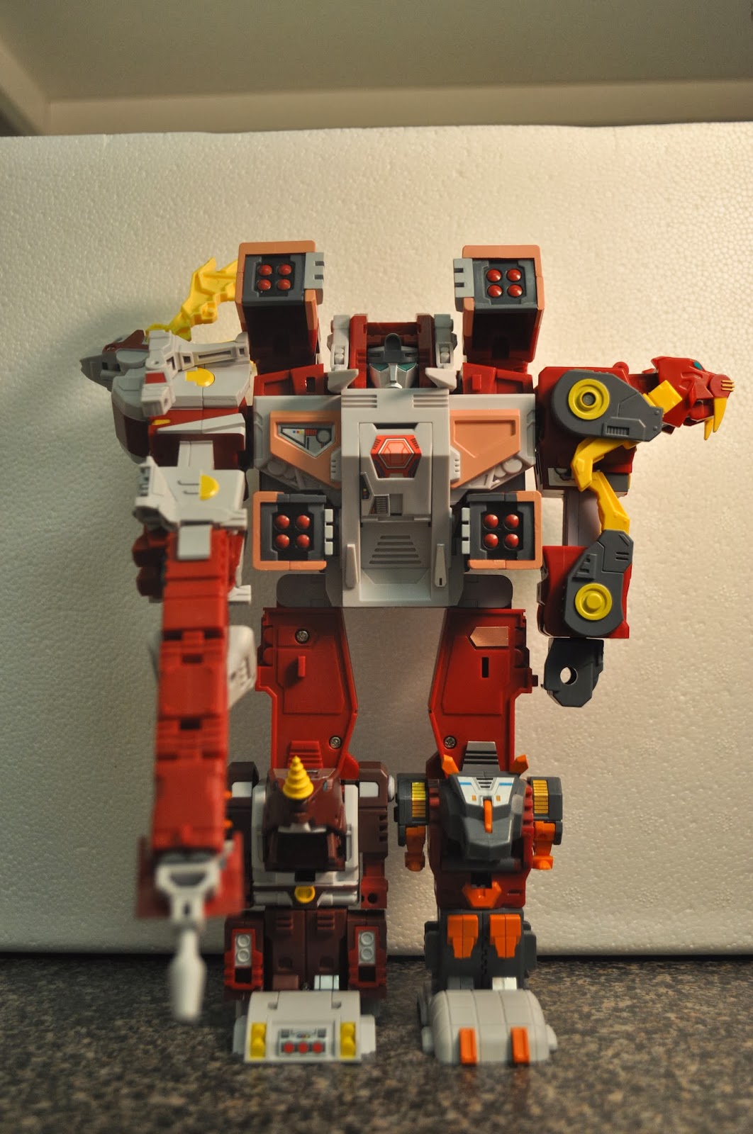
For my birthday this year, Meg surprised me with five pretty awesome not-Transformers:
Love the packaging on these.

Now, I say "not-Transformers" because they're unlicensed toys made by Fansproject, a third-party company, and not Hasbro or Takara. I've really gotten into the third-party toys because they're making some awesome stuff that Hasbro/Takara never would due to cost.
Extinct animals.
Back when elbows were a luxury.

They're designed to look like toys from the heyday of the original Transformers toyline: chunky, limited articulation, and fairly simple designs. Here's a shot of one next to an official Transformer of similar design.
These were the pinnacle of design in the late '80s.

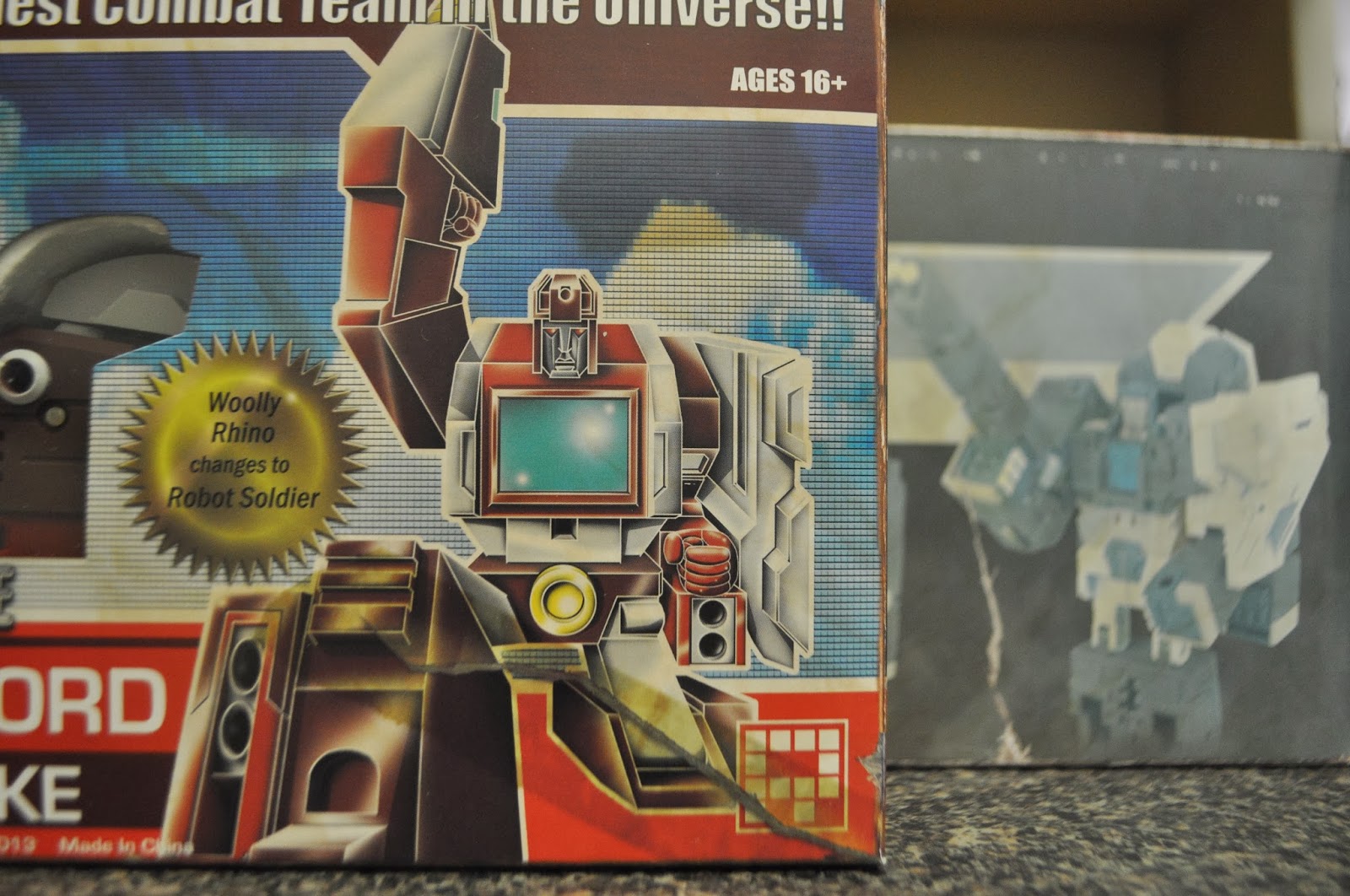
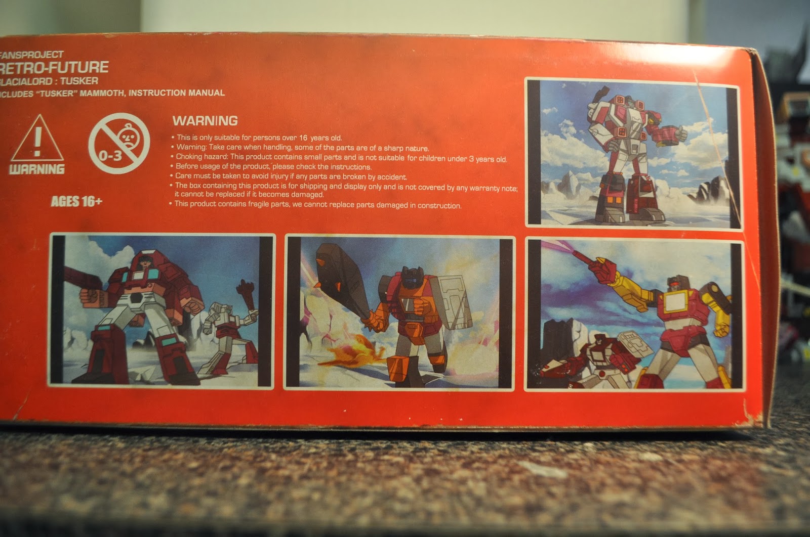
The real hook for these is that Fansproject went whole hog in giving them a very retro feel - like they were toys that you must have missed when they were on shelves in the '80s. Even though they're brand-new, the packaging is designed to look like it's faded, torn, and taped.
Notice the stains, taped rip, and scuffed edges; all printed detail.
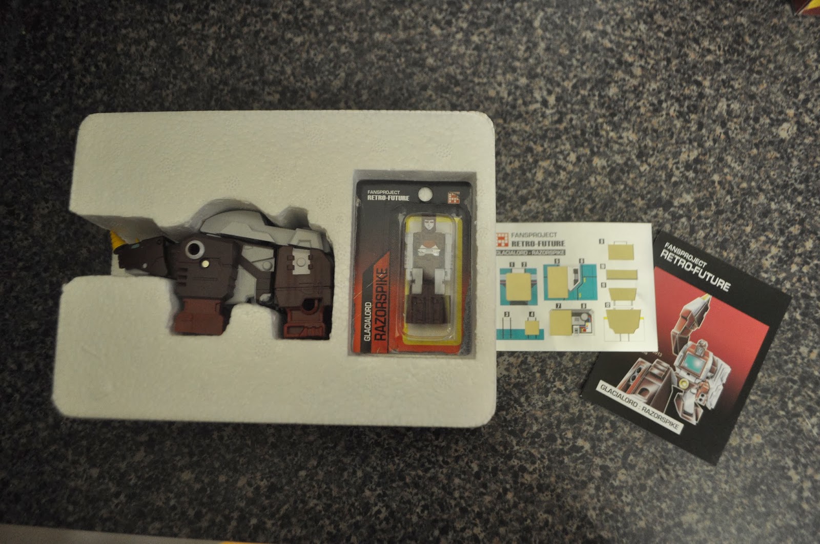
Even the sticker sheet is partially applied.

The marketing for these was incredible. You've got the retro designs, the retro boxes, heck, they even drew up fake animation cels for the packaging. But this is far from the best part.
They were even in the cartoon? Must have been episode from overseas...
You may have noticed in the first picture in this post, one of the boxes didn't match (hint, it's the lower left box). As I mentioned early, the idea was that these were found toys from the '80s. They were shipped out one at a time to people that ordered them online. When it came time to ship out the last figure, Fansproject posted on their blog that, unfortunately, the entire shipment of that figure had fallen off the boat and was lost.

A few days later, Fansproject made another post claiming that all hope wasn't lost. During the closing of an old warehouse overseas, workers found unopened cases of the Korean version of the figure. Luckily, everyone would get the figures they ordered!
This is why you want all five!

Thursday, September 30, 2010

Roku

I've decided to take a small break from posting about changes to the HART website to talk about something else for a bit.

After watching Apple's keynote a while back about the AppleTV, I wanted to get one; specifically the latest one. Most people who know Meg and I know that Apple products tend to cause an unnecessary lust in us. Having something that allows us to easily watch Netflix streaming on the bedroom TV without costing us extra subscription fees (looking at you, Xbox 360) sounded like a little bit of heaven. After doing some research though, I decided to go with a Roku player instead of the AppleTV.

If Apple products give Meg and I such boners*, why would we go with Roku? Was it the fact that the Roku was cheaper? No, but it helped. Was it the fact that the Roku provides a lot more functionality out of the box? Not really. So what was it? Cloth Tag.

It's like a stuffed animal I can't comfortably cuddle with!

It should arrive soon, and I'll probably post something about it.

* For some reason when Meg says that something gives her a boner it sounds funny; for me it sounds all kinds of creepy.

Monday, September 27, 2010

The Rough Cut

Fun Fact: When I was in high school, I made a website that
was basically nothing but beveled/embossed images. It's
apparently an addiction I've never kicked.
After taking Meg's initial sketch, we came up with.... this. I don't even know what to say about it; not one of our better designs. You can see the actual current layout in there, if in a rough state. The header is obviously completely different; a bit newsletter-y in all honesty. It has the upper and lower bars, Bob & Bonnie, links to GoodSearch, etc., the United Way & CFC banner, and the links to other adoption websites that we post our pets to. We wanted to have a solid header and footer that would appear on every page, and this is a start. We were trying to produce a glass-like effect on the two red bars, which we didn't manage to accomplish. From this version, the only things that made it onto the final website were Bob & Bonnie and the United Way/CFC banner.

As far as the content is concerned, the featured pets column may as well be empty. The announcements section is pretty close to finished. It's mostly just missing some of the coloring. The Events section isn't even a section at this point, just a banner and links to the adoption schedules.

Fun Fact: The Bob & Bonnie images were extracted pretty roughly
and have never been cleaned up. Why? Laziness mostly.
Here we cleaned up the header a little bit. Lost the ridiculous font and added some more base navigation. The significant change is the addition of the content to the Feature Pets column. We liked the idea of a short blurb stating what HART actually does. That text was part of the About HART section on the previous website, but it seems appropriate to not make a user click through to figure out what you're about. Since most people are visiting the website to actually adopt a dog or cat, we wanted to feature links to our major sections. You may notice a link to a "Precious Pets Ad." HART used to feature a pet in a local newspaper for a while, until it became incredibly expensive. We eventually replaced this link with one to a page listing our pets that have special needs. Seemed like a better use of the space.

Wednesday, September 15, 2010

It Starts

Paul and Joli had started to work on the website redesign before they'd brought us on board and had a basic framework of a new website already started. While I don't have a picture of their design, it had a lot of the elements that made it into the final design. Meg and I took what they'd started and began to merge it into the designs we'd been working on.

The beginnings of the final design
The design lost the menu on the left, which really wasn't all that necessary. It also cut the page width to 800 pixels to prevent scrolling from side to side on most displays. The page also gained a solid footer which helped to frame the design.

You can see the major block elements that make up the current homepage here: Announcements, Upcoming Events, Adoptable and Featured Pets. These would get rearranged a bit, but they're there.

The final design doesn't have an explicit fund raising area on the homepage, but that was done to help prevent the page from becoming cluttered again.

While I was playing around with this layout, Meg sketched some stuff out in Photoshop.

Insert content here
It looks incredibly simple, but it's from this image that the entire current design came about.

Monday, August 30, 2010

Baby Steps...

As soon as Joli asked us to help redesign the website, we started work on a basic layout. We weren't sure at first how much of a change they really wanted, so we tried to keep it at least somewhat similar to the existing design.

Website version .01
Step one was to strip out all of the random links and "ads" that no one probably even saw. Again, we wanted the main page to be no more than a single screen; if it made the user scroll, it had to go.

Step two was to rearrange the left menu a bit. We grouped the links a bit more logically and added indents for grouped items. We also added a basic menu across the top of the page of the links we felt were the most important.

We placed an Announcements section at the top. It's not really evident in the screens from the previous website, but any announcements, lost pets, etc. appeared under the "Welcome to HART!" text. We wanted give them their own area so they would stand out more.

Other small changes, the "HART Spotlight" became "Featured Pets" and got bigger, the Events section moved up the page a bit, and "Overlooked," "Special Needs," and "Needs Fosters" lost their images and were condensed a bit to make it above the fold.

Website version .02
We made a slight revision of this layout later on. The biggest changes were losing the color behind the left menu and the "Events" sections.

In addition, "Events" became "Upcoming Events" with a heading that matched the Announcements heading. We also added a "Fund Raising" section. This section would have some of the more "ad" type things, such as the Awesome Sauce, GoodSearch, etc.

On one hand, we like this second version because it had more white space, and felt more open, but at the same time, it is a bit boring.